In today’s ceaseless stream of social media and digital content, attention is the new currency. We’re inundated with information at every turn, from smartphone notifications to billboard-plastered cityscapes. How does a message break through the noise in this visual cacophony and make a lasting impact? For design students, understanding this concept is crucial. Visual elements can convey an entire epic in a single image or guide someone through a complex journey with just a few carefully chosen colors and shapes. Visual elements are powerful tools for storytelling, capable of conveying complex narratives without relying on words. They are transforming the way we communicate in the digital era.
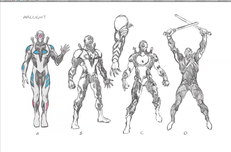
In our recent Design Culture Co-Create Learning Series, speaker Lalit, a renowned illustrator and comic book artist, explained how visual elements serve as the building blocks of compelling narratives. Drawing from his expertise in both illustration and comic book creation, Lalit’s unique perspective bridged the gap between traditional storytelling and modern visual communication. In this blog, we’ll explore these aspects of visual narratives and uncover the secrets behind their effectiveness.
5 Key Strategies for Telling Great Visual Stories
1. Craft Visuals That Speak to the Heart, Not Just the Eye
The power of visual storytelling lies in its ability to elicit emotional responses. While technical skill is important, the emotional impact of a visual narrative is paramount. A technically flawless piece that fails to evoke emotion or connect with the audience misses the mark in storytelling. Every visual element should serve a purpose in conveying the intended message.
Imagine a public health campaign poster about the importance of community support during difficult times. Instead of a polished, sterile image of a hospital, the designer opts for a hand-drawn style depicting people supporting each other. This approach, while less “perfect,” feels more human and relatable, evoking empathy and warmth. What do you think about this poster idea? Does the hand-drawn style work better than a slick photo? Drop your thoughts in the comments below!
Lalit acknowledges the importance of learning and practicing design techniques. However, he emphasized that technical proficiency alone isn’t enough. The real goal is to become adept at using these skills to communicate effectively and evoke emotions.

2. Know the Why, Who, and When of a Design Project
Understanding the purpose of design is crucial for delivering effective visual solutions. Knowing the “why” behind a design project provides direction and ensures the final product aligns with the intended goals, whether it’s to inform, entertain, or persuade. Identifying the target audience, or the “for whom,” helps tailor the design to meet specific needs, preferences, and expectations, creating a more engaging and relevant experience. Additionally, being aware of the timeline, or “how much time we have,” allows for proper planning and prioritization of tasks, ensuring that quality is maintained without compromising deadlines.
In a scenario where you need to create a visually appealing flyer that highlights the keynote speaker, given the tight deadline, drawing a single, detailed portrait would be more feasible and impactful than attempting to include ten individual faces representing various aspects of the event. This approach not only saves time but also focuses attention on the main attraction, making the flyer more striking and easier to understand at a glance. By considering these factors, designers can create visual narratives that are not only aesthetically pleasing but also meaningful and impactful. What do you think about this flyer strategy? One detailed portrait vs. ten quick sketches – smart move or missed opportunity? Share your thoughts in the comments!
3. Striking the Right Note by Minimizing Visual ‘Noise’
Good design is about making deliberate choices and prioritizing what truly matters. It involves the art of subtraction—removing the unnecessary to reveal the essence of the message. It allows the essential aspects of the design to shine through and communicate effectively.

He mentioned, “A big part of art is to understand what is important to eliminate in something which is not required to be there.”
Lalit used a familiar analogy from music to clarify the concept. He explained that when a piece of music has too many instruments or layers competing for attention, it can become chaotic and difficult to follow, losing its coherence and impact. Similarly, in design, adding unnecessary graphics, text, or embellishments can clutter the visual space, confusing viewers and diluting the core message.
4. Design Without Research is Like Building Without a Blueprint
Before embarking on any design project, conducting thorough research is crucial as it forms the bedrock of informed decision-making and effective problem-solving. It provides valuable insights into industry trends, competitors’ strategies, and best practices, empowering designers to innovate while avoiding pitfalls. It sparks creativity by exposing designers to diverse perspectives and solutions that can set the design apart. Therefore, investing time in comprehensive research before diving into design ensures that the resulting solutions are well-informed, impactful, and capable of meeting both user and business objectives effectively.
5. Design Thrives on Trial and Error
Failure is an inevitable part of the design learning process. When designers embrace trial and error, they learn valuable lessons from their mistakes and setbacks. These experiences help them develop resilience, problem-solving skills, and a deeper understanding of what works and what doesn’t in design.
“Creating an artwork and knowing the fact that a lot of it will not be used, even though it is good; accepting the fact and working accordingly is necessary for any designer to avoid frustration,” Lalit quoted.
Embracing trial and error instills a sense of curiosity and openness to exploration. It encourages designers to take risks, push boundaries, and think outside the box, which are essential qualities for aspiring designers.

At ARCH, we believe that design evolves from both academic learning and real-world experiences, enriched by guidance from industry experts. Our annual design creative learning sessions are led by industry experts who share valuable insights and guidance and cover all aspects of design. By bringing these experts into the learning journey, we aim to inspire, educate, and equip students with the skills and understanding needed to excel in their careers. The knowledge gained from these sessions can serve as a benchmark for design students, setting a high standard for their academic and professional development. Our goal is to bridge the gap between academic learning and real-world application, ensuring that students are well-prepared for future challenges and opportunities.
Our comprehensive design creative learning series covers everything from fundamental principles to advanced techniques. For more knowledge-rich content, check out our full learning series now. Don’t stop there—subscribe to stay updated on the next DCLS series and other exciting initiatives by ARCH under Design Culture. Whether you’re a beginner or looking to refine your skills, these resources offer valuable insights to enhance your design expertise. Your future design projects will thank you!
